P4U
Website Design
Challenge to face
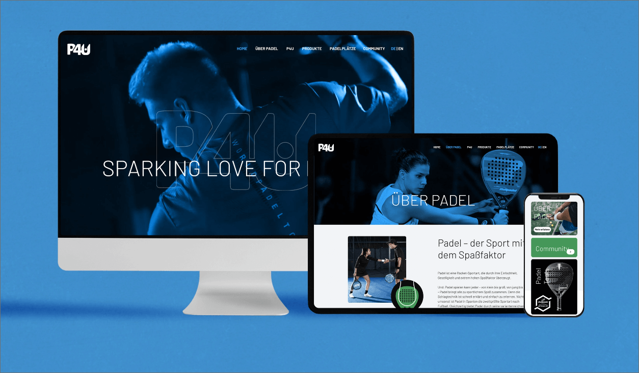
When it came to designing the padel website, major challenges included: limited awareness in some countries, technical difficulties, strong competition, language barriers and the integration of social media. However, a well thought-out strategy with clear navigation, appealing design, informative content and tight integration of social media could help to overcome these issues to build a successful website dedicated to the sport of padel.
The UX & UI-Concept
USABILITY
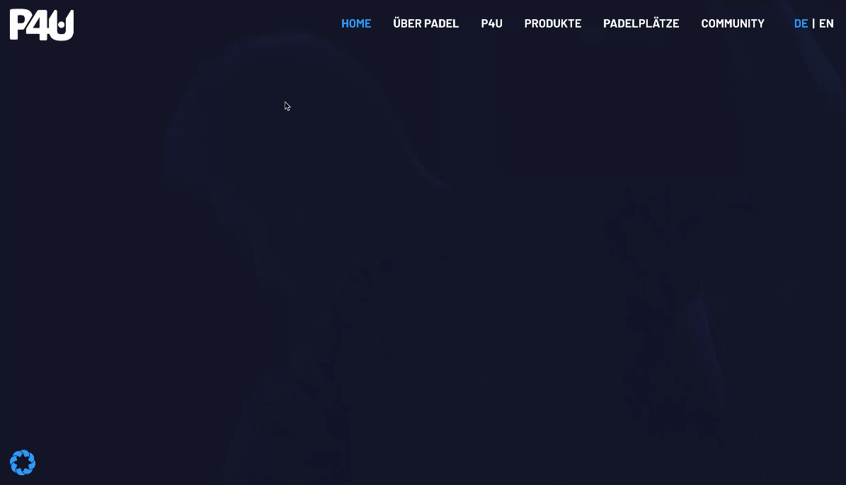
The website’s structure is user friendly and easy to navigate. The most important information like the rules of the game, tournaments and locations of sports fields are easy to find.
COLORS & IMAGES
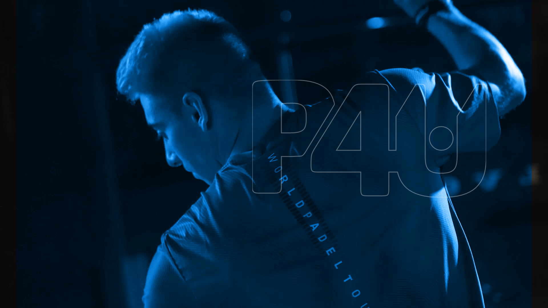
The colours used are eye-catching and vivid to mirror the energy of the sport. Images and videos of Padel players and events are prominently placed on the website.
COMMUNITY
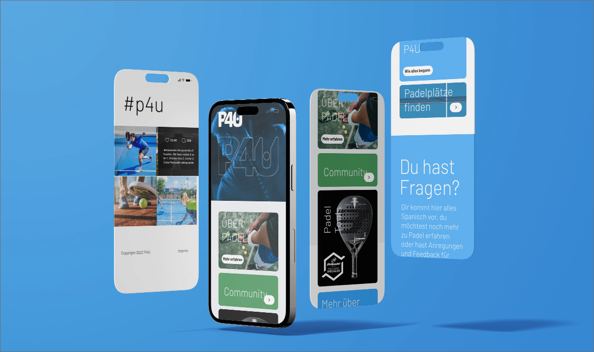
The integration of social media platforms like Facebook, Twitter and Instagram leads to a higher reach for the website and boosts the Community’s engagement.
#p4u
Since the padel community is very active on social media, it was essential for us to design a website that could integrate with these platforms to achieve greater reach and address the community at different touchpoints.
Design System & UI-Kit
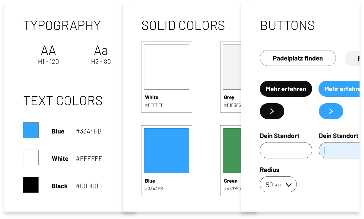
The design elements used have a high value of recognition due to their vibrant colours and noticeable look and feel. They are easily readable on multiple interfaces - the landing page, a social media channel or an advertising column.
Clicktrough
This video gives a short insight into the products functionalities. It shows an interactive prototype that you the possibility to experience products and services in the virtual world.


